Invoice Pro
Date
May - June 2024
digital invoicing tool
Role
UX Design, UX Research, UI Design

Progressive Enhancement
While both desktop and mobile devices are important for small business owners, there is a notable shift towards increased mobile device usage due to the flexibility and convenience they offer. Keeping this in mind, I designed the mobile app for Invoice Pro first, as I determined that this would be the device most target users would use to experience the product. Using the research conducted for that project, I then moved on to designing a responsive website for the digital invoicing tool.
To view the UX research portion for this project, click here.
STARTING THE DESIGN
Sitemap
I started off the design process by building a sitemap that was user-focused, ensuring that my personas can successfully complete their key objectives. My goal was to make strategic information architecture decisions that would make the overall website navigation simple and easy.

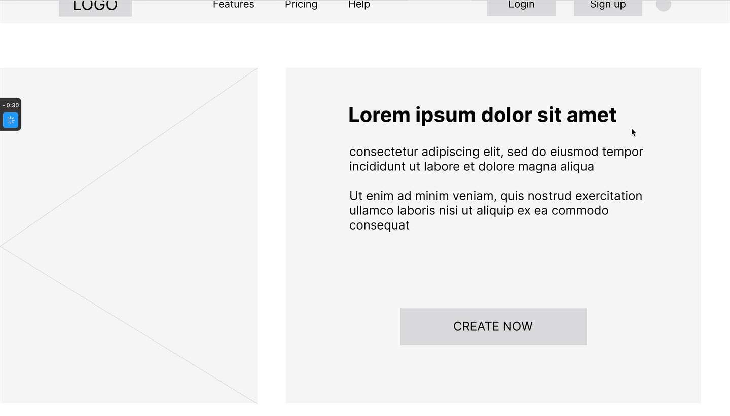
Paper wireframes
Focusing on the core features identified during the user research, I moved on to sketching out paper wireframes for different screens and came up with multiple versions to compare and refine.
Homepage

Create an Invoice

Paper wireframe screen size variations
I also started to work on designs for additional screen sizes to make sure the site would be fully responsive.

Digital wireframes
After refining my paper wireframes, I converted them into digital wireframes based on user needs, goals, and pain points uncovered during research.


Low-fidelity prototype
I created a low-fidelity prototype from the user flow diagram and wireframes to test functionality before incorporating it into the final design and ensure accessibility for end-users.
Usability study: parameters
Study Type:
Unmoderated usability study
Location:
United States, remote
Participants:
4 participants
Length:
15-20 minutes
A usability study was conducted to test out the main user flows and get feedback on the navigation and layout. The main findings uncovered were that:
1
Navigation
Without a preview of the subcategories on the homepage, it was difficult for users to find different pages of the website
2
Most users wanted an option available to print the invoice after they were done saving it
3
Payment Info
The payment information was not clearly displayed on the create an invoice page
REFINING THE DESIGN
Modifications
Based on the findings and insights from the usability studies, I made modifications and applied design changes to the mockups to improve the user experience.

I improved the homepage navigation by displaying subcategories of different pages under each category.

I made the payment information display more user friendly and removed the ‘Preview’ button since the invoice preview is visible once you save it anyway. I also added a ‘Print’ button.
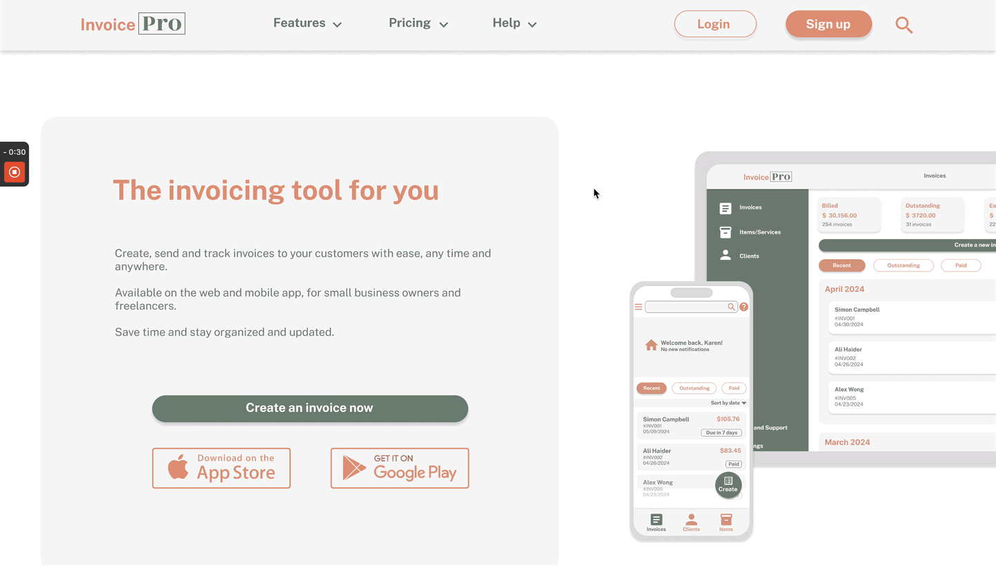
Mockups: Original screen size

Homepage

Dashboard

Invoice preview

Login

Create invoice

Send Invoice
Mockups: Screen size variations

High-fidelity prototype
FINAL TAKEAWAYS
Impact
Our target users shared that the website design was consistent with the app and provided a coherent user experience. The navigation was also simple and straightforward, making it easy to accomplish the main user flow.
Learnings
There were several things I learnt from the method of progressive enhancement or bottom up designing. Some of the key learnings were:
-
Cross platform consistency
-
Accessibility considerations for a larger screen size
-
Adaptive layouts
-
Enhancing user experience without overwhelming the user